

The World Gold Council Design System
One stop shop for all, styles, grids, components and templates. Giving designers a place to rapidly prototype and iterate, developers pixel perfect references to build and clients a styleguide to ensure consistency cross the business
Brief.
A collection of styles, components and templates to be the digital source of truth for the WGC
Challenge.
A collection of styles, components and templates to be the digital source of truth for the WGC
Solution.
A collection of styles, components and templates to be the digital source of truth for the WGC
A streamlined development process
The client wanted to move quickly. With the rollout of a new brand and a new pillar of business, we adopted a streamlined, agile workflow.
1. Design
Figma
Components built in Figma with strict grids and spacing all tokenised for easy development
2. FrontEnd Dev
Storybook
Direct pipepline into Storybook, the library of components all bit out and functional, ready to be used
3. CMS Dev
Drupal
The devs would then pull the designed components from Storybook to be used in the CMS
Three palettes for three distinct branches of business
We just launched a fresh brand to take over the old one. With a new pillar and a bunch of microsites added, we were worried about things getting a bit inconsistent on the website. So, we had to make sure to keep the colors and components uniform.
Design
Components built in Figma with strict grids and spacing all tokenised for easy development
Design
Components built in Figma with strict grids and spacing all tokenised for easy development
Design
Components built in Figma with strict grids and spacing all tokenised for easy development
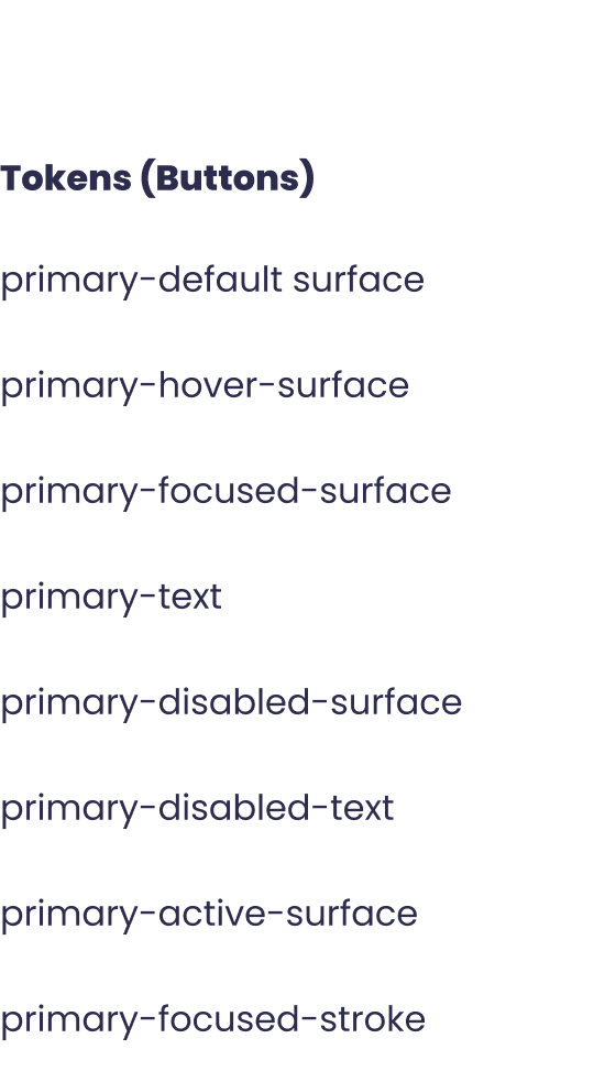
Tokenisation of colours
The flexibility of tokens enabled us to use the same three components across the three primary brand colours. On top of that, we implemented both light and dark modes, ensuring seamless adaptability across different backgrounds.
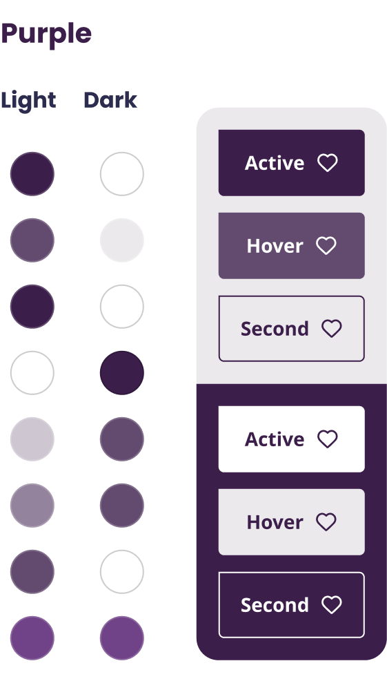
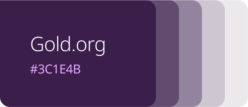
Purple
The purple color is the closest to the lead color (although the others are mostly on even parity), serving as the primary corporate lead. It conveys neutrality and personality sufficiently to represent all aspects of the business.
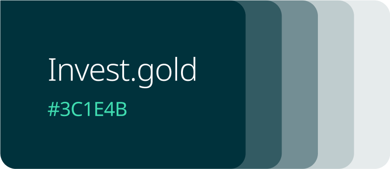
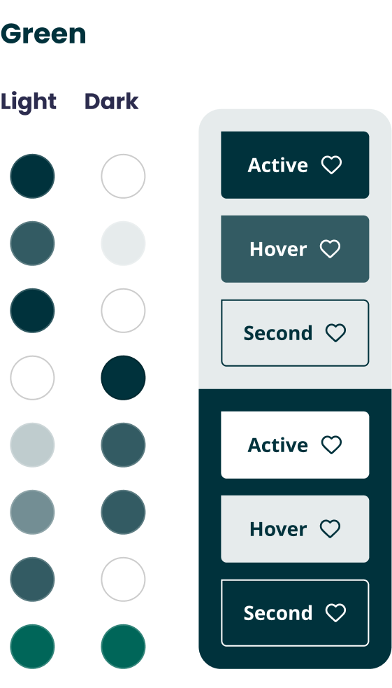
Green
Green was the colour chosen to represent the retail branch. It conveys warmth, friendliness, and aligns with the company’s ESG values.
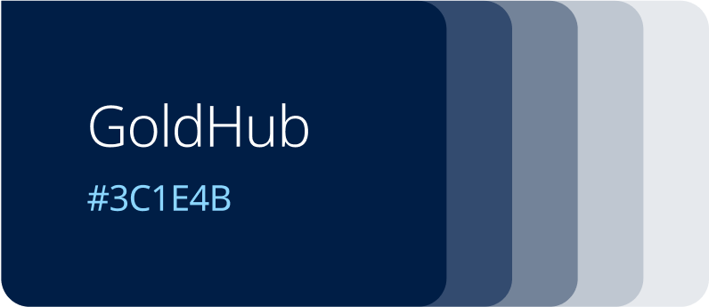
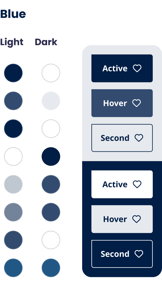
Blue
Blue, being the coldest colour, has a more serious tone that perfectly aligns with the data driven aspect of the business.
Three palettes for three distinct branches of business
We just launched a fresh brand to take over the old one. With a new pillar and a bunch of microsites added, we were worried about things getting a bit inconsistent on the website. So, we had to make sure to keep the colors and components uniform.
Purple
The purple color is the closest to the lead color (although the others are mostly on even parity), serving as the primary corporate lead. It conveys neutrality and personality sufficiently to represent all aspects of the business.
Green
Green was the colour chosen to represent the retail branch. It conveys warmth, friendliness, and aligns with the company’s ESG values.
Blue
Blue, being the coldest colour, has a more serious tone that perfectly aligns with the data driven aspect of the business.