
Capital Economics
What we did
Brand + UX / UI
Industry
Tech
Problem
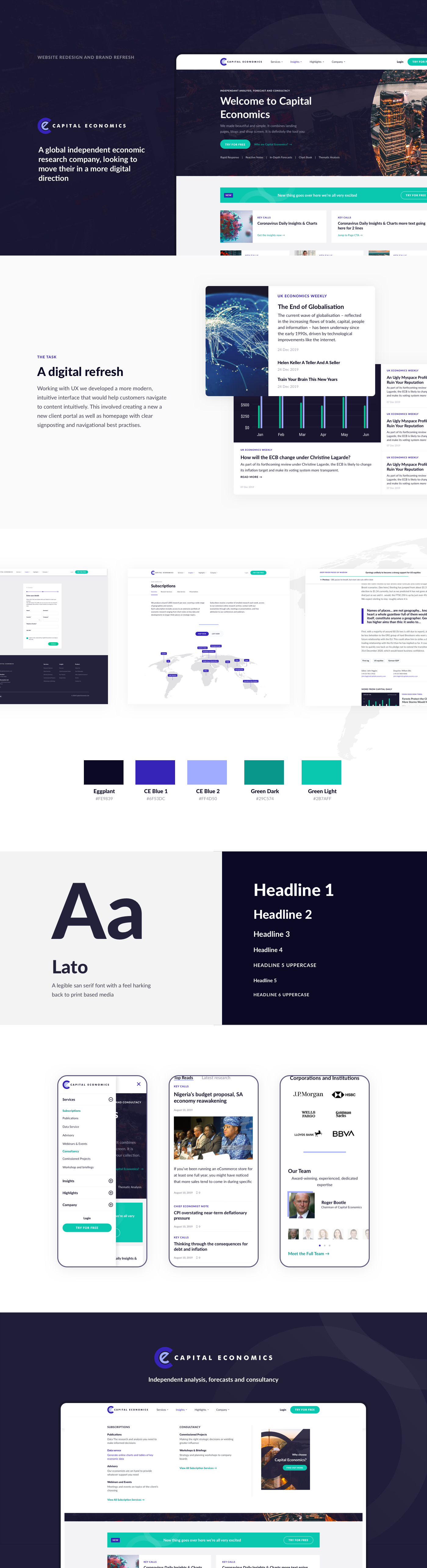
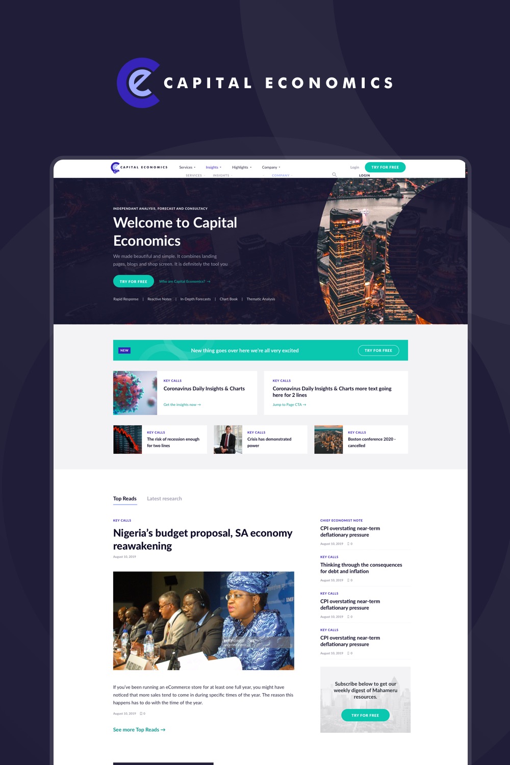
Capital Economics had strong content but a digital presence that wasn’t doing it justice. The existing site felt dry and static, presenting complex economic data without any sense of narrative or hierarchy. For a research platform competing for the attention of institutional clients, that was a real gap.
Approach
Working alongside a UX lead handling flow and structure, I focused on the UI, specifically on how to bring the editorial experience up to the standard of the content itself. The core challenge was making data-heavy research feel approachable without dumbing it down. That meant thinking carefully about how charts, standfirsts, and headlines could work together to tell a story at a glance, rather than just presenting information in isolation. Accessibility was also a priority, generating a palette that stayed true to the Capital Economics brand while meeting contrast standards across all contexts.
Solution
The redesign introduced a cleaner editorial framework with clear typographic hierarchy, improved text widths, and reading aids like table of contents and progress indicators to help users navigate longer reports. Authorship and content metadata were surfaced more clearly, giving the platform a more editorial feel. The responsive design brought the same quality of experience to mobile, where a significant portion of their audience was reading. A refreshed colour system balanced brand recognition with accessibility, moving away from the flat, hard to read palette of the original.
Outcome
The result was a more modern, readable platform that positioned Capital Economics alongside the quality of its content. Improved hierarchy and navigation made it easier for users to find, read and engage with research, and the responsive overhaul ensured a consistent experience across devices.