




Gold Principles
What we did
Brand + UX / UI
Industry
Financial Services
Website URL
Problem
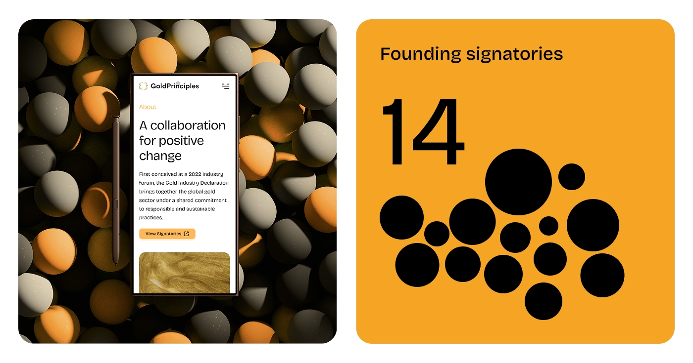
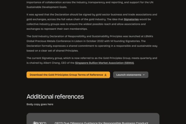
The existing Gold Principles site needed a significant overhaul. Inconsistent typography, no clear hierarchy, and a lack of structure undermined what should feel like an authoritative industry document. For a formal declaration backed by the World Gold Council and 14 founding signatories spanning the full gold value chain, that credibility gap mattered.
Approach
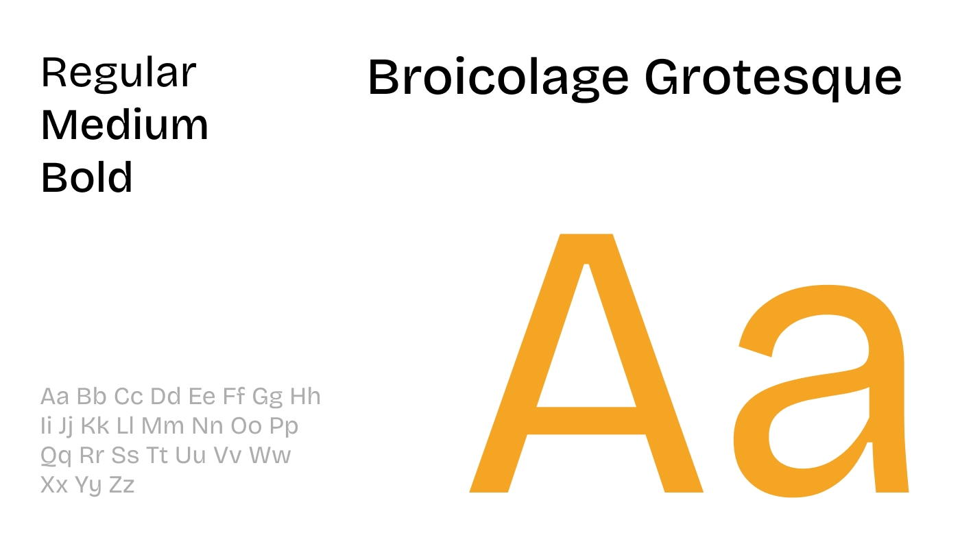
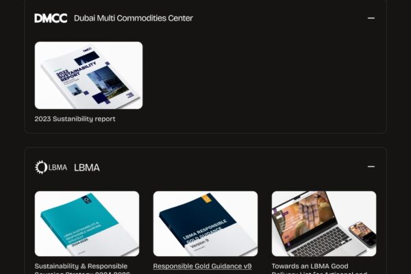
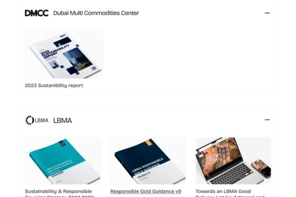
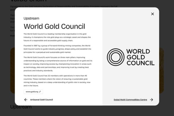
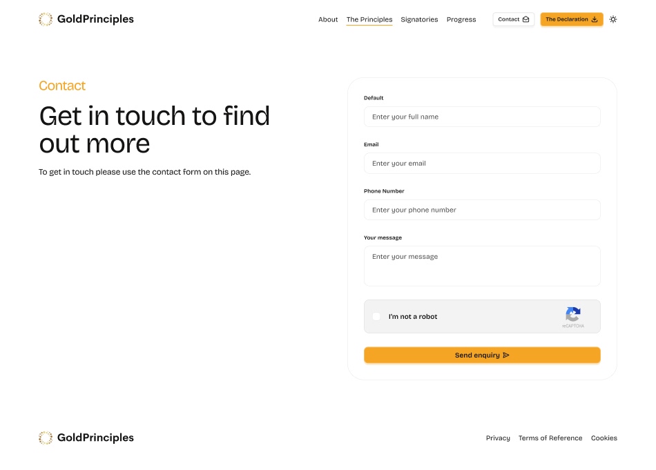
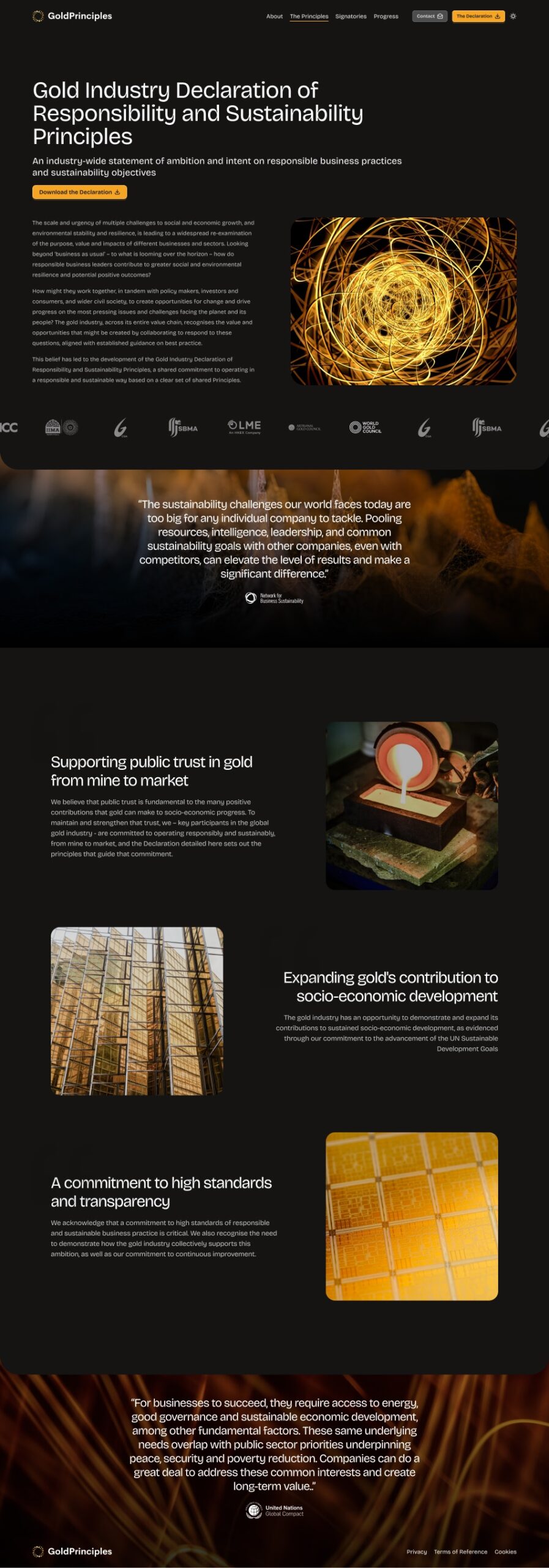
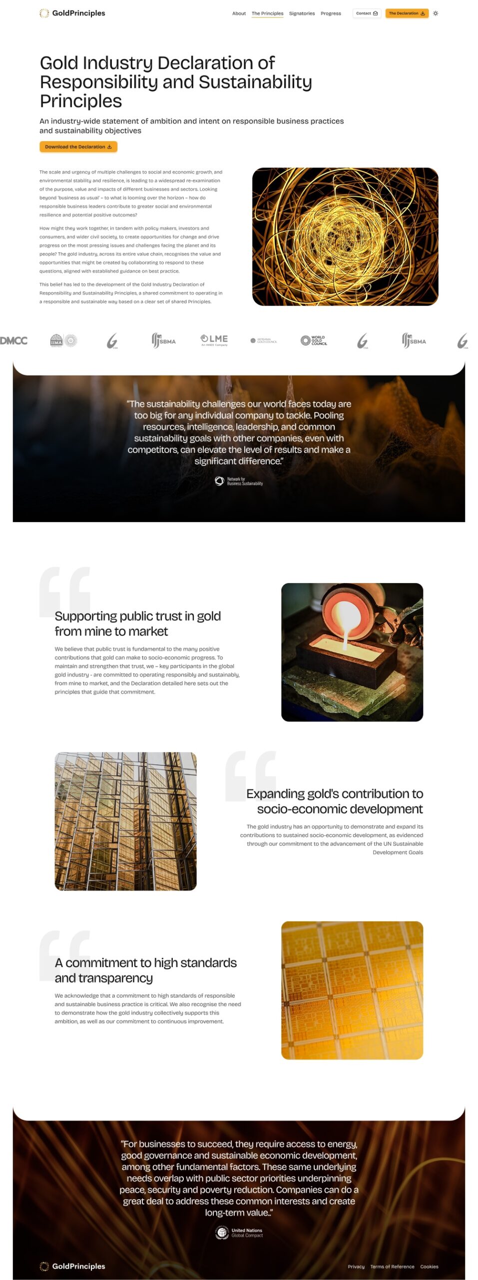
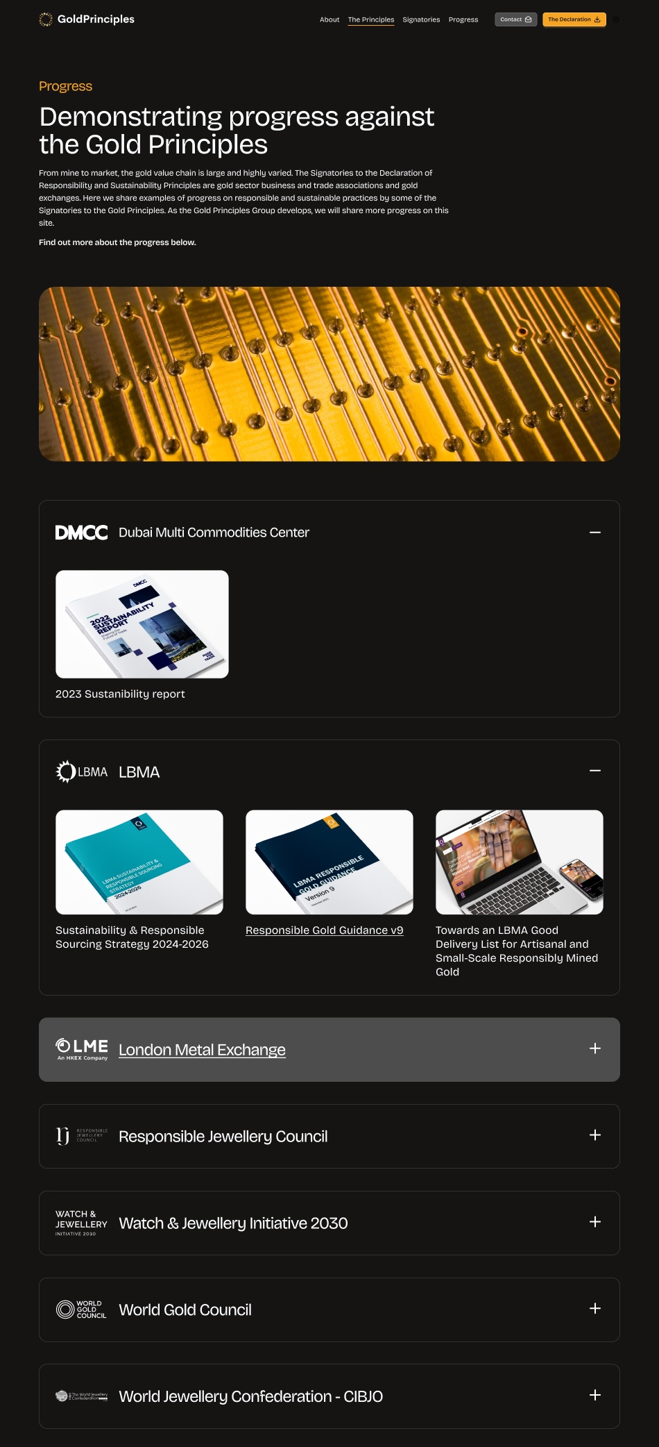
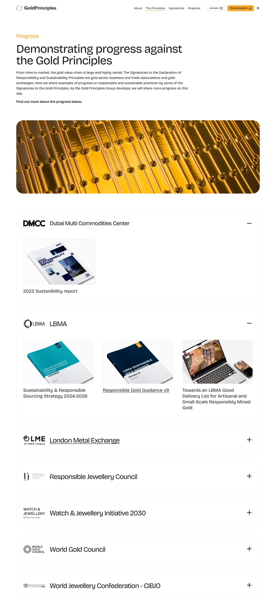
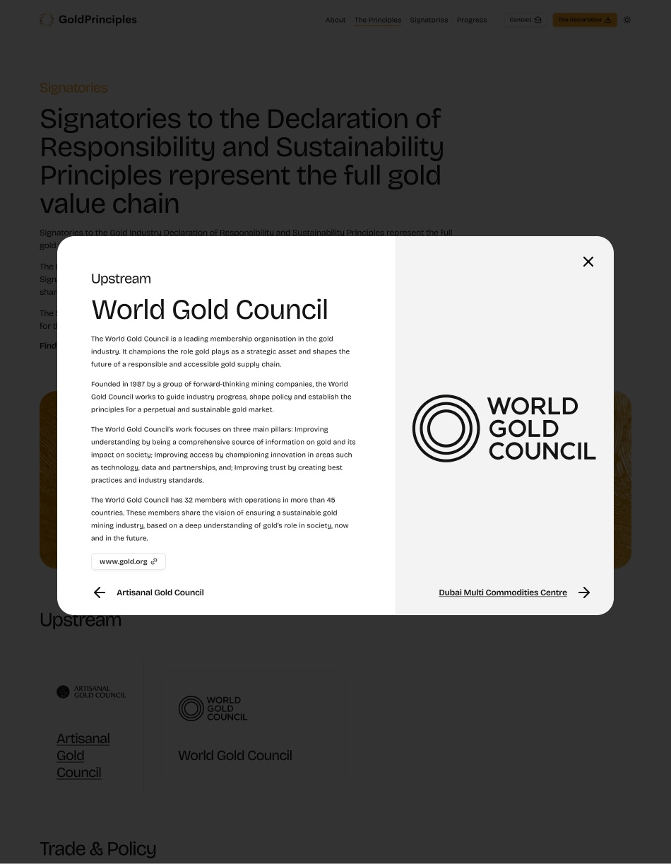
The redesign prioritised authority and readability from the start. The content is dense and largely legal in nature, so typographic decisions were critical. A typeface rooted in print tradition but contemporary in execution gave the content the weight it deserved. Spacing was used generously throughout to make long-form reading comfortable rather than laborious. The signatory section required careful thought, with a wide range of organisations across the gold value chain each needing clear, consistent presentation.
Solution
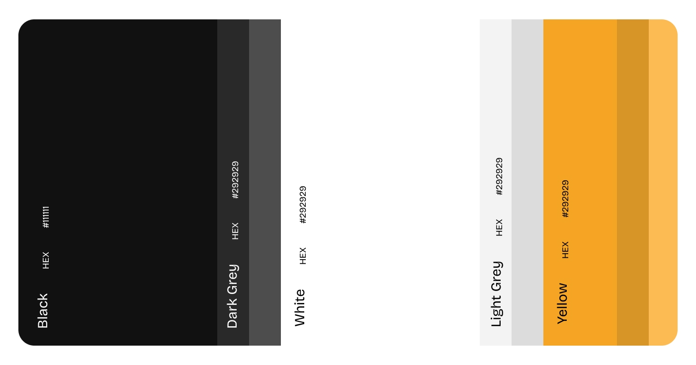
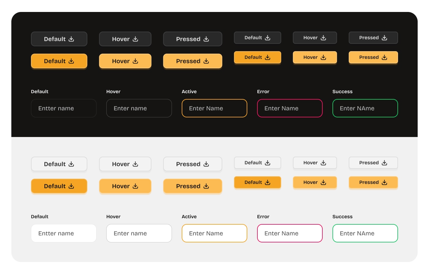
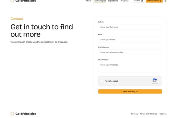
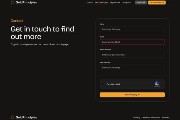
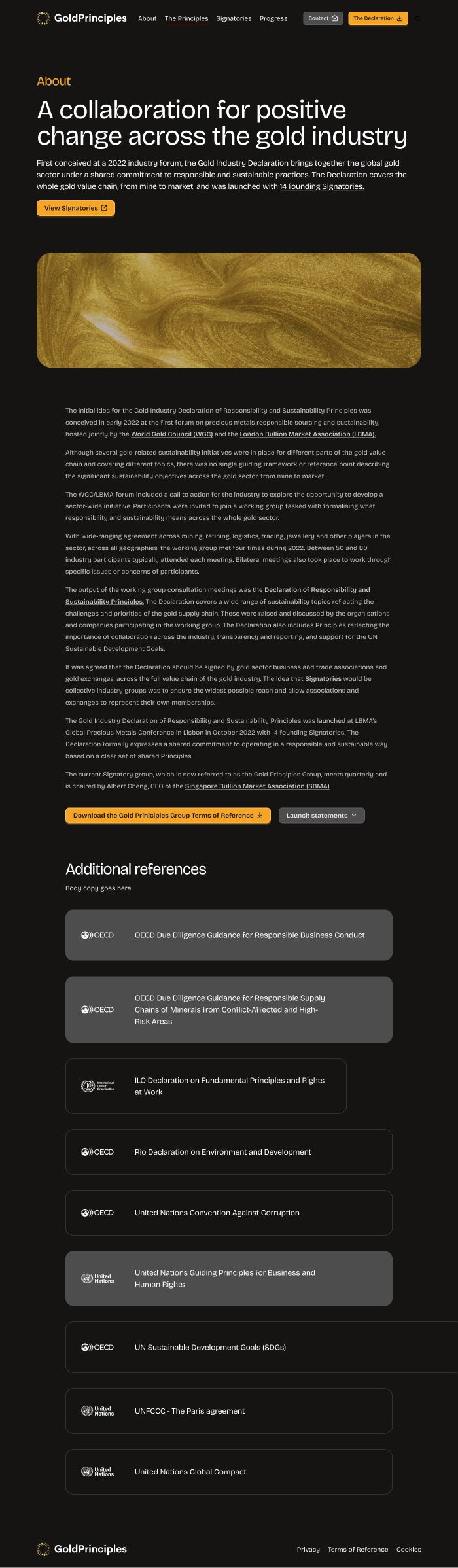
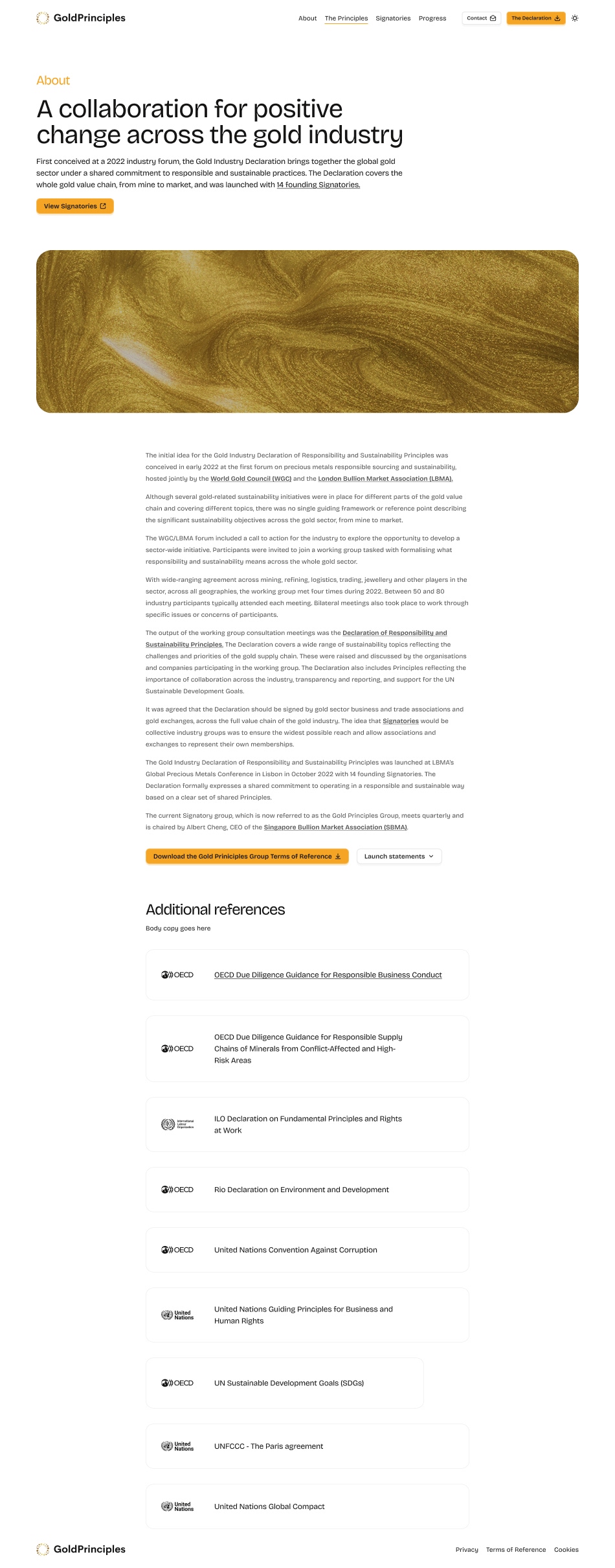
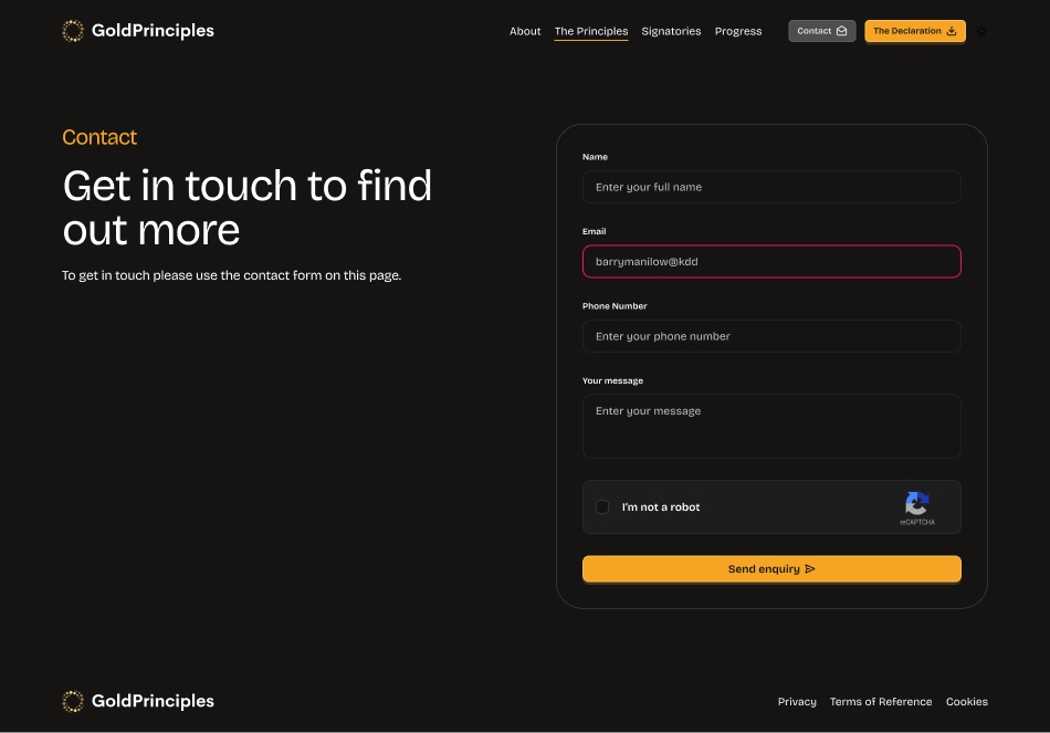
Light and dark modes were introduced, dark mode aiding long-form reading while working naturally with the branding. Gold as a colour was treated with restraint, reserved exclusively for calls to action around the declaration itself. The signatories section was structured with modals, giving each organisation room to tell their story without cluttering the main page flow.
Outcome
The client was happy with the result and the site has held up well as a reference point for the declaration. The work directly led to a commission for a spinoff project, the London Principles, using Gold Principles as the design foundation.