
SPDR GoldShares
What we did
Brand + UX / UI
Industry
Tech
Who did it
Project Overview
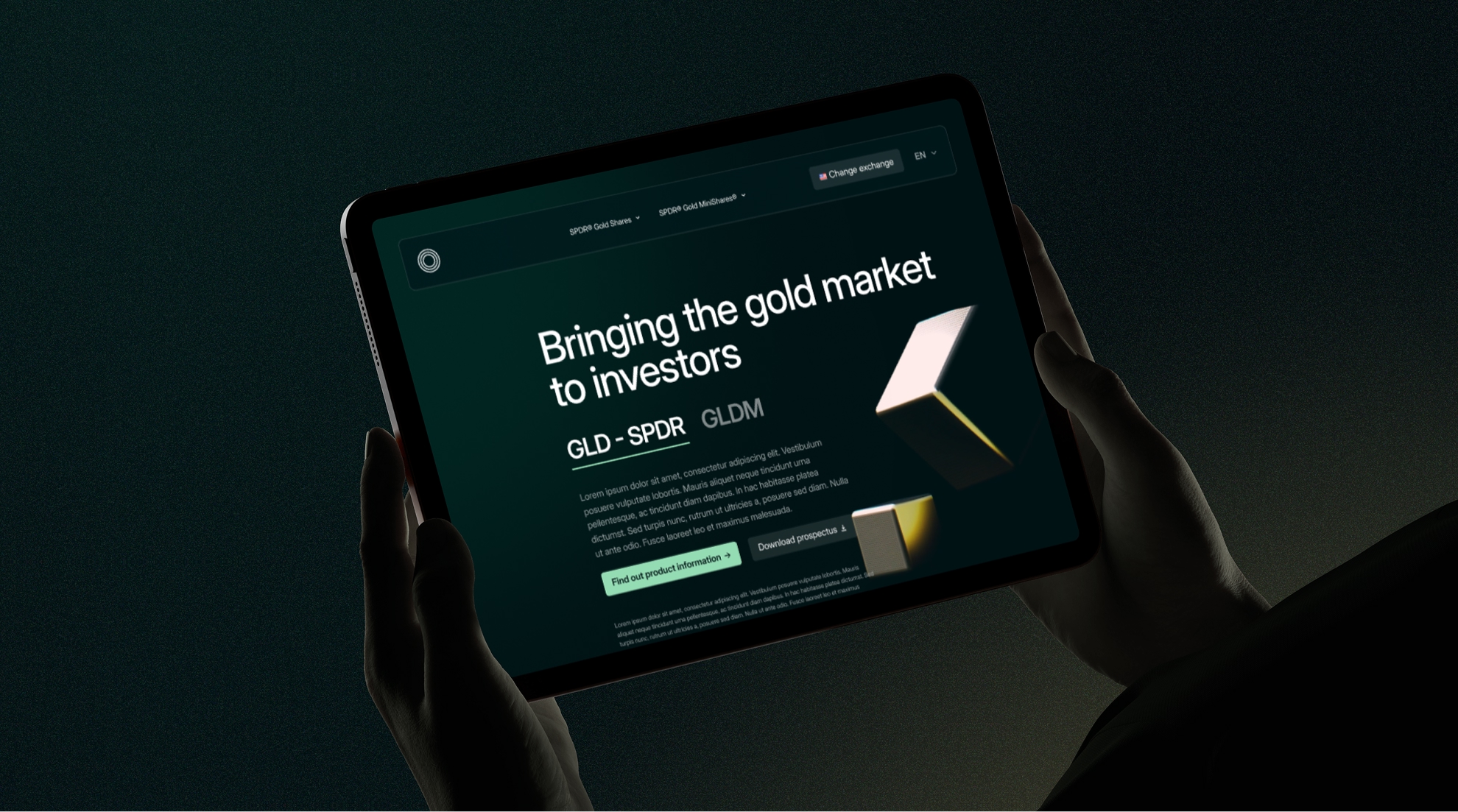
This project involved redesigning the SPDR Gold Shares digital experience for the World Gold Council, with the aim of modernising the platform while maintaining the trust, authority, and regulatory clarity expected of a global investment product. The redesign focuses on clarity, confidence, and ease of use for both retail and professional investors.
UX Challenge
The existing site contained a high volume of financial data, documentation, and disclosures, which made it difficult for users to quickly understand the products and find relevant information. The core challenge was to reduce cognitive load without oversimplifying or compromising regulatory requirements.
UX Strategy
The experience was restructured to clearly separate product discovery from product depth. The landing experience prioritises orientation, helping users understand the products, select their exchange, and enter the correct regional context. More detailed pages are designed for exploration, performance review, and due diligence.
Clear hierarchy, modular layouts, and progressive disclosure were used throughout to guide users naturally from high-level understanding to detailed data.
Product Differentiation
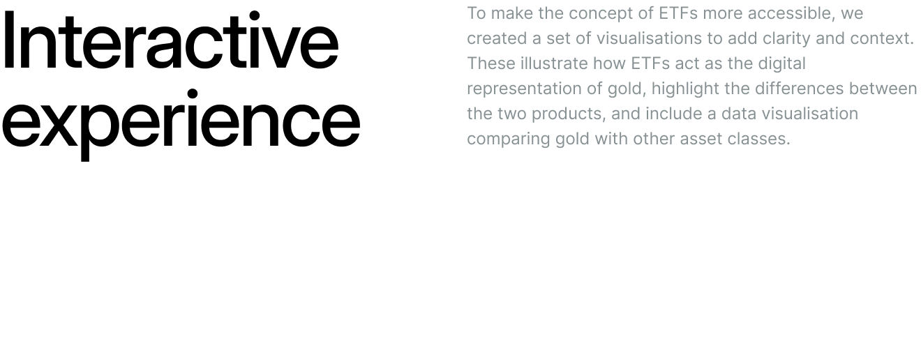
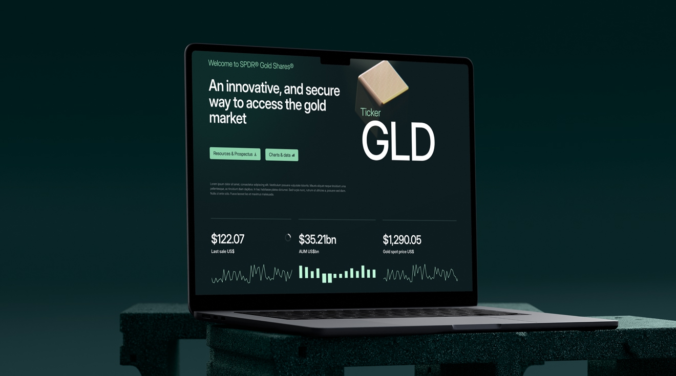
SPDR Gold Shares and SPDR Gold MiniShares are differentiated through animated gold cube visuals, which act as both a visual anchor and a conceptual metaphor. The cubes represent scale and precision while reinforcing the physical gold backing of each product.
These animations are deliberately subtle and functional, supporting storytelling and brand presence without distracting from data or decision-making.
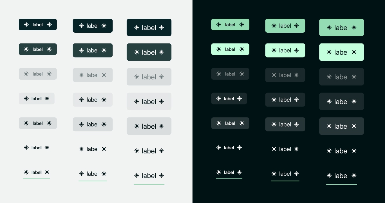
Interface and Visual Design
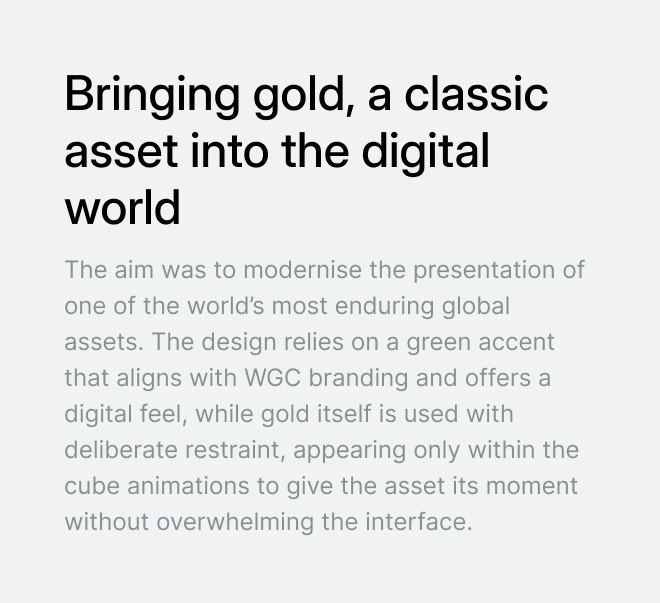
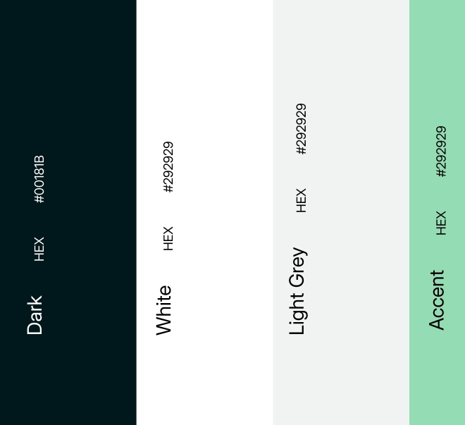
The interface uses a dark, restrained colour palette with controlled gold and green accents. This creates a calm, premium environment that supports data-heavy content while reinforcing associations with value and stability.
Typography is confident and highly legible, with strong contrast and consistent spacing to ensure accessibility and readability across complex tables and charts.
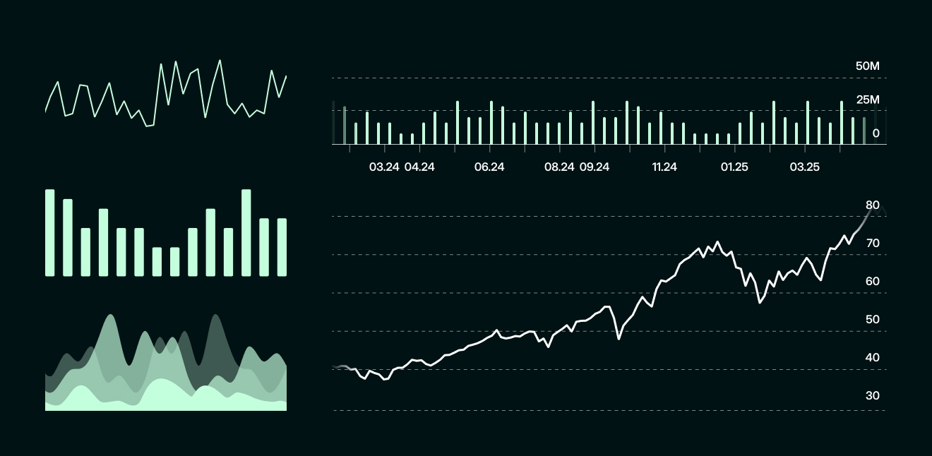
Data and Usability
Performance data, holdings, and regulatory information are structured for fast scanning and comparison. Key figures are surfaced first, with secondary information clearly grouped to reduce visual noise.
Charts and tables are treated as practical tools rather than decorative elements, allowing users to quickly assess performance, costs, and tracking quality while retaining access to full documentation.
Global and Regulatory Considerations
Given the global nature of the products, exchange selection and localisation are surfaced early in the journey. Legal notices and disclosures are integrated cleanly into the layout, ensuring transparency without disrupting the overall experience.
Outcome
The redesign delivers a clearer, more modern platform that balances authority with usability. It improves product understanding, reduces friction when navigating complex financial information, and positions SPDR Gold Shares as a confident, contemporary investment brand.